 Overbite
How we measured
Overbite's numbers come from the real product where that was possible and from applied rules where it was not. This page says which is which. Web, tablet and the iPhone 13 were measured in November 2026. The iPhone Pro and iPhone Pro Max are estimated, and Android was not measured.
Who built Overbite?
Overbite is built by Serhii Khvala. You can find him at khvala.com and on X as @serhiyhvala. Overbite is not affiliated with X Corp.
Why does it exist?
A banner can look right on a laptop and lose its edges on a phone, and you only find out after you upload it. Overbite puts that check inside the design step. The editor shows what each device covers while you work, and these guides publish the same numbers for anyone who designs somewhere else.
How were the numbers measured?
| Device | Status | Method |
|---|---|---|
| Web and tablet | Measured, November 2026 | Measured on x.com at 1440, 1169, 820 pixels wide. |
| iPhone 13 | Measured, November 2026 | Measured from a screenshot of the X app. The banner box, profile picture, buttons and status bar match that screenshot. The notch size is Apple's. |
| iPhone Pro, 402×874 screen | Estimated | iPhone 13 layout rules applied to this screen and its safe area. |
| iPhone Pro Max, 440×956 screen | Estimated | iPhone 13 layout rules applied to this screen and its safe area. |
| Mobile Safari | Checked | Observed showing the full 3:1 banner, so the side cut looks specific to the app. |
| Android | Not measured | No numbers exist for it here. |
The estimated iPhone Pro row is a 402×874 point screen and the estimated iPhone Pro Max row a 440×956 point screen, the sizes of the iPhone 16 Pro and 17 Pro models. Older Pro models have different screens and are not covered.
On the iPhone 13 the banner sits in a 390×156 point box. The app cover-fits the image and centers it, which gives the side cut of about 125 pixels. The app also places its header relative to the safe area, and those two rules are what the estimates reuse.
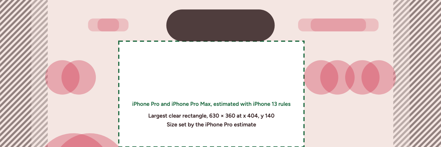
How was the safe zone calculated?
All device numbers live in one file of code, and the editor, the diagrams and these guides all read from it. To find the safe zone, a test checks each of the 750,000 pixels of a 1500×500 banner against the covered shapes on all five devices, using circle profile pictures. The largest rectangle with no covered pixel is 630×360. The iPhone Pro estimate sets that size. On measured devices alone, meaning web, tablet and the iPhone 13, the largest clear rectangle is 647×397 at x 395, y 103. 45% of the pixels are covered on at least one device. On measured devices alone the figure is 37%. The shapes keep their real rounded corners. If a device number changes, that test fails until the published values match.
What is not covered?
- Android phones and tablets. Nothing here was measured on Android.
- iPhones other than the three listed, and the X app on iPad.
- How X compresses an upload. Image quality after upload was not tested.
- Larger text settings and browser zoom.
- Future changes. X can change its layout at any time, and these numbers will not follow.
X's header details come from its own help pages, linked in the Twitter banner size guide. X publishes no separate header file size that we could find, and the guide says so.
How can you check your own device?
Take a screenshot of your own profile in the X app and compare it with the safe zone overlay or the diagrams for each device. If your numbers differ, tell @serhiyhvala on X.