 Overbite
Twitter banner safe zone
The X (Twitter) banner safe zone is the largest rectangle nothing covers: 630×360 pixels at x 404, y 140 on a 1500×500 banner, across web, tablet and three iPhone screens. An estimated iPhone sets that size. Measured devices alone give 647×397 at x 395, y 103. Android was not measured.
Where is the safe zone on a Twitter banner?
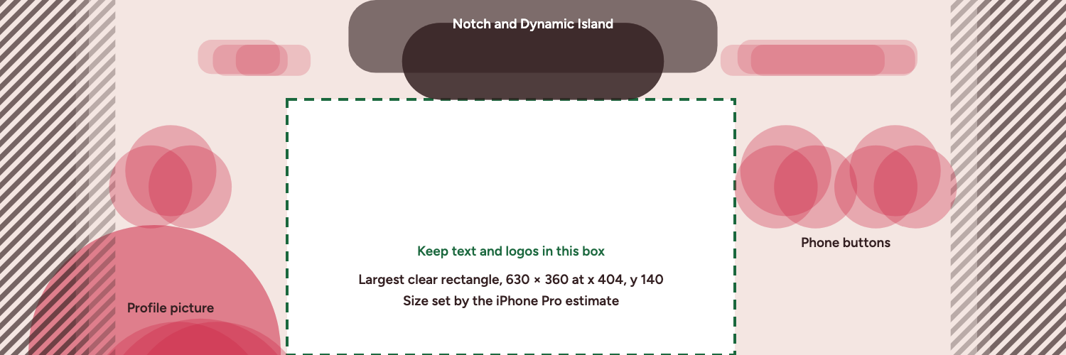
The largest clear rectangle runs from x 404 to x 1034 and from y 140 to y 500, measured from the banner's top-left corner. Those 630×360 pixels hold about 30% of the banner. Anything inside them stays visible on web, tablet, the iPhone 13, the iPhone Pro (estimated) and the iPhone Pro Max (estimated).
The iPhone Pro estimate sets that size. On measured devices alone, meaning web, tablet and the iPhone 13, the largest clear rectangle is 647×397 at x 395, y 103. The rectangle is not centered. Its middle sits 31 pixels left of the banner's center, because the phone buttons on the right reach further in than the profile picture on the left.
45% of the banner area is covered on at least one of the five devices. On measured devices alone the figure is 37%.
- Largest clear rectangle
- Profile picture and phone buttons
- Notch and Dynamic Island
- Status bar
- Cut off in the X app
Is there clear space outside the rectangle?
Yes. About 45% of the clear pixels sit outside it. The largest piece is a 304×178 block from x 1034 to x 1338, below y 322. It suits a short line or a small logo beside your main text. The estimated iPhone Pro sets its top and right edges too.
What covers the banner on each device?
Each device hides a different part of the banner. The numbers below are in banner pixels, so they map directly onto a 1500×500 canvas. The y values count down from the top edge.
| Device | Profile picture center | Radius | Top band ends at | Phone buttons end at | Source |
|---|---|---|---|---|---|
| Web and tablet | x 218, y 495 | 177 px | Nothing there | No buttons | Measured, November 2026 |
| iPhone 13 | x 282, y 590 | 141 px | y 104 | y 304 | Measured, November 2026 |
| iPhone Pro, 402×874 screen | x 306, y 582 | 129 px | y 140 | y 322 | Estimated, iPhone 13 layout rules on this screen |
| iPhone Pro Max, 440×956 screen | x 250, y 582 | 129 px | y 140 | y 322 | Estimated, iPhone 13 layout rules on this screen |
Web and tablet
Only the profile picture covers the banner here. It is a large circle at the bottom left, reaching up to about y 317 and across to about x 395.
iPhone 13 (measured)
The X app cuts about 125 pixels from each side. The notch and status bar take the top down to y 104, and round phone buttons sit below them, ending near y 304. The profile picture is smaller than on web, starting near y 449.
iPhone Pro (estimated)
This row is a 402×874 point screen, the size of the iPhone 16 Pro and 17 Pro, with iPhone 13 layout rules applied to it. It has the largest side cut, about 162 pixels, and the Dynamic Island and status bar reach y 140. The phone buttons end near y 322.
iPhone Pro Max (estimated)
This row is a 440×956 point screen, the size of the iPhone 16 Pro Max and 17 Pro Max, also with iPhone 13 layout rules applied. The wider screen keeps more of the banner, losing about 107 pixels per side, with the same top band and button depth as the estimated iPhone Pro. Older Pro models have different screens and are not covered.
How much does the profile picture overlap the banner?
The overlap is largest on web and tablet. There the circle has a radius of about 177 pixels and starts near y 317, so it covers the bottom 183 pixels at its tallest point. On the iPhone 13 the circle is smaller and sits lower, covering about 51 pixels of height.
The phones matter for a different reason. Along the bottom edge, the circle ends near x 395 on web and x 391 on the iPhone 13, but near x 405 on the iPhone Pro (estimated). A logo starting at x 400 clears both measured devices and still touches that estimate.
Does a square profile picture change the safe zone?
Yes. A square covers its corners too, so the largest clear rectangle narrows to 600×360 pixels, starting at x 434. Its other edges stay the same. The editor has a circle and square switch in the Profile panel, and its warnings follow that choice.
Why is this smaller than the numbers in other guides?
The arithmetic is simple. A centered 1300 pixel wide box runs from x 100 to x 1400. The iPhone 13 cut removes the outer 125 pixels per side, so that box loses 25 pixels per side. On the iPhone Pro (estimated) it loses 62.
Width is only part of it. The rectangle here also starts below the notch or Dynamic Island, keeps clear of the phone buttons, and stays right of the profile picture. A wider box has to ignore at least one of those.
How do you use the safe zone?
- Put text, logos, handles and faces inside the rectangle.
- Let backgrounds and decoration run to the edges. Nothing is lost if they are hidden.
- Stay a few pixels inside the edges. The rectangle's corners graze the shapes around it to within a pixel, which is why the editor's Move it keeps 4 pixels of clearance.
- Stop important text above the bottom edge, for the reason below.
X says "60 pixels on the top and bottom could be cropped" on different monitor sizes and browsers. Our browser measurements at 1440, 1169, 820 show a full 3:1 box, but plan for X's figure. To allow for it, the rectangle stops at y 440, leaving 630×300. The X app on the iPhone 13 behaves differently, keeping the height and cutting the sides.
Does the safe zone apply to Android?
We do not know. Android was not measured, so treat these numbers as web and iPhone numbers only. To design with the marks in your own tool, or to start from a finished layout, see the free banner templates. The Twitter banner size guide has the wider spec, and the method notes show how the rectangle was found.